Japanese Calligraphy Design
case01“THE JAPANESE BITTERS/ LIQUEUR”
JCC AGENT
(JAPAN)
Label Design for JCC AGENT (Yamazaki Shuzo) – “The Japanese Bitters” & “The Japanese Liqueur”
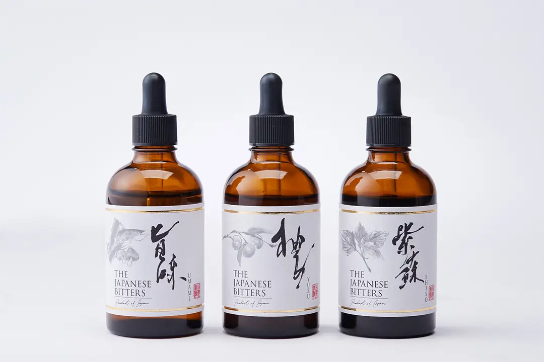
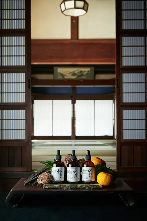
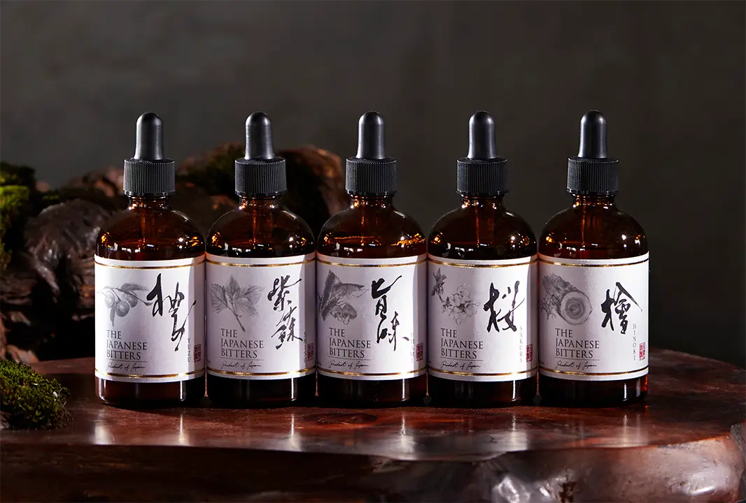
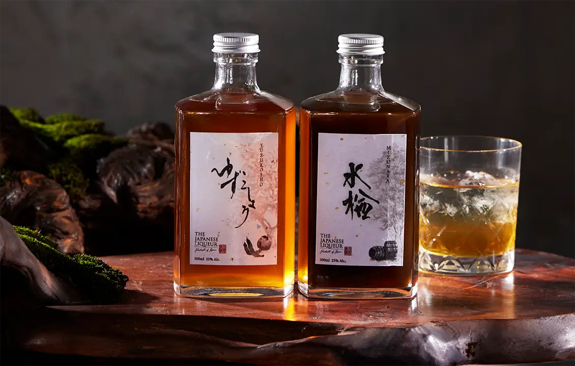
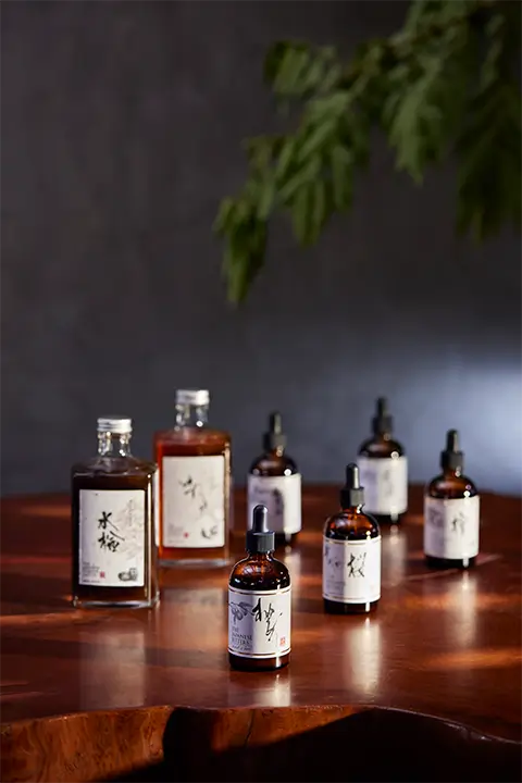
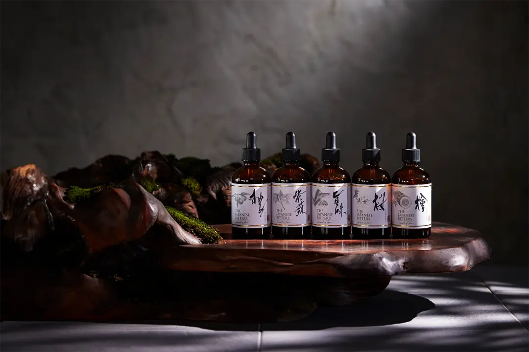
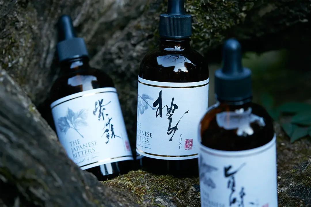
We were responsible for the label design of “The Japanese Bitters” and “The Japanese Liqueur”, premium Made-in-Japan liqueurs developed by JCC AGENT (Yamazaki Shuzo) and distributed worldwide. With a strong desire to introduce authentic Japanese flavors to the global market using only domestically sourced ingredients, we incorporated traditional sumi-e (ink wash painting) to depict the raw materials and used calligraphy to express the unique flavors.
For the first product in the series, Yuzu, we presented multiple design proposals. The client, President Yamazaki, promptly shared these designs with several international importers for feedback, ensuring a meticulous selection process for the global launch. The lineup features unique flavors such as “Umami”̶inspired by Japanese dashi̶and “Sakura”, among others. Each label design, from calligraphy to sumi-e artwork, is carefully crafted to maintain a cohesive series identity while highlighting the distinct character of each flavor.
Beyond label design, we now oversee the overall creative direction, including distillery design and product photography. “The Japanese Bitters” has since won a Bronze Award at the IWSC (International Wine & Spirits Competition) and was ranked in the Top 10 in the Bitters category of DRINKS INTERNATIONAL 2024.- Design Lead
– Design Lead –
- Label Calligraphy
- Label Sumi-e Artwork
- Product Logo Design
- Seal Design
- Comprehensive Label Design
- Product Photography & Visual Direction
- Brochure Design, etc.
case02“MAIL”
MARUTI SUZUKI
(INDIA)
Following the calligraphy performance at the 2003 Geneva Motor Show for a new vehicle unveiling, we were entrusted with the calligraphy logo design for “MAIL (Mobility Automobile Innovation Lab)”, an open innovation program launched by MARUTI SUZUKI in India. This initiative brings together the automotive industry and startups to develop new mobility services, with support from the Indian government.
We were informed that the request for a calligraphy-based logo stemmed, in part, from Suzuki’ s historical success in downsizing automobiles through collaboration in India. Writing the Latin alphabet in calligraphy presents a unique challenge, as it requires balancing legibility and artistic expression. Among the several proposed designs, the final selection featured a dynamic and highly legible style that conveys a sense of speed and motion.
Initially, a live calligraphy demonstration was planned for the launch event in India, but it was later canceled, and instead, a visual concept video was produced to showcase the logo.
– Design Lead –
- Calligraphy Logo Design
case03FERME YAMASHITA
(FRANCE)
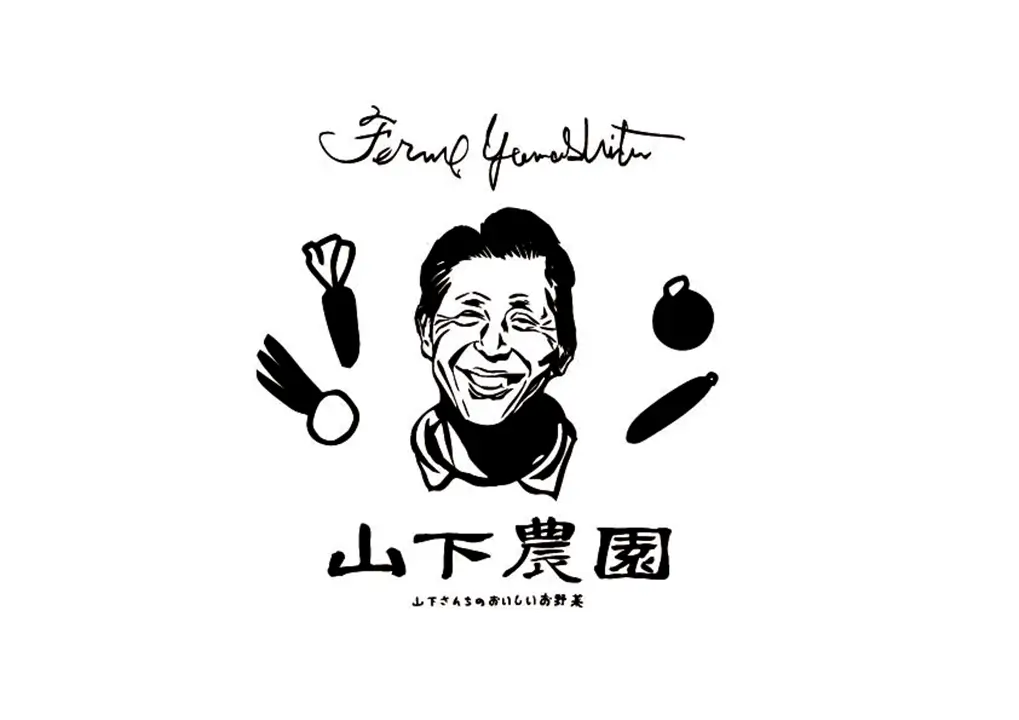
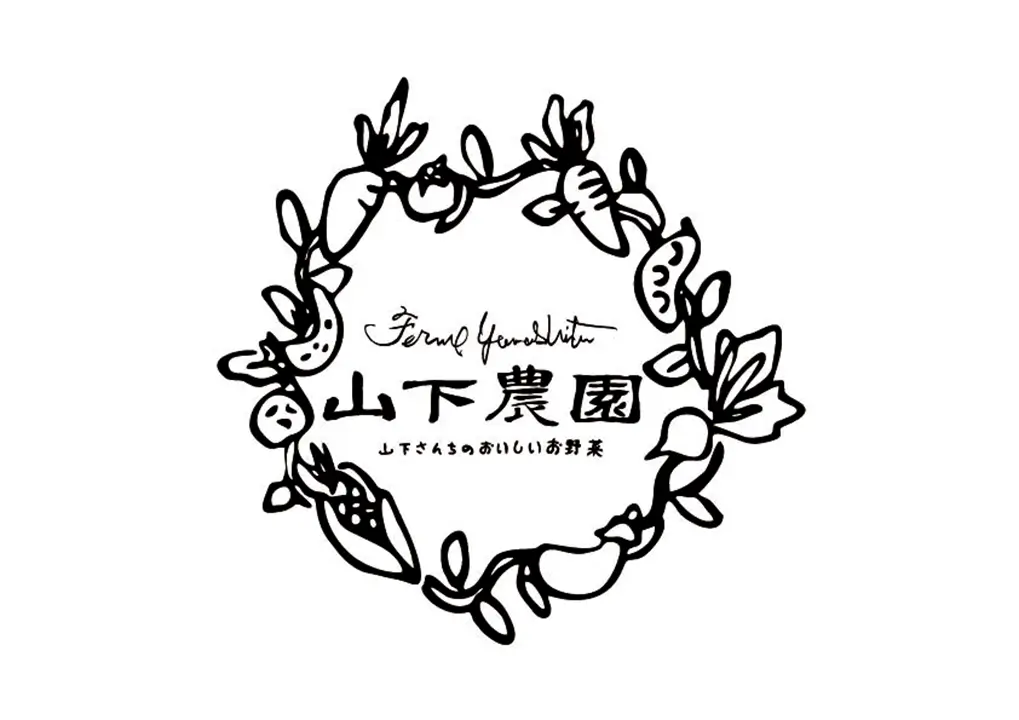
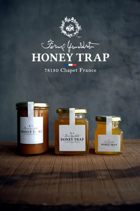
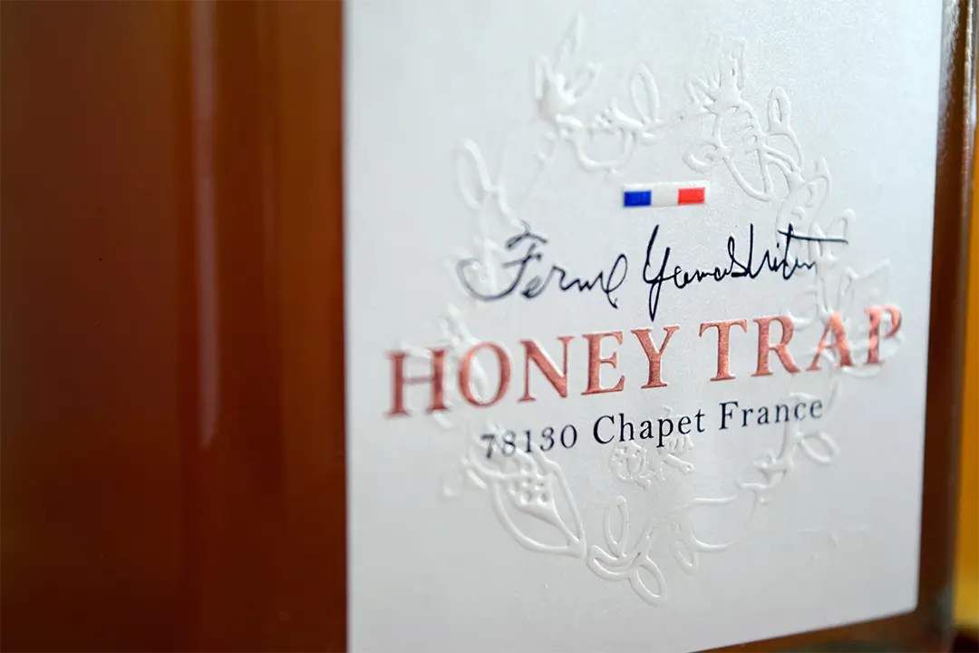
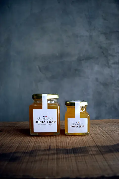
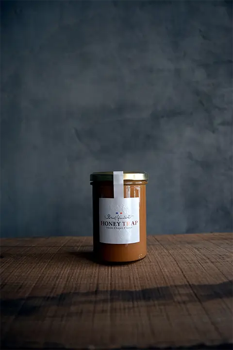
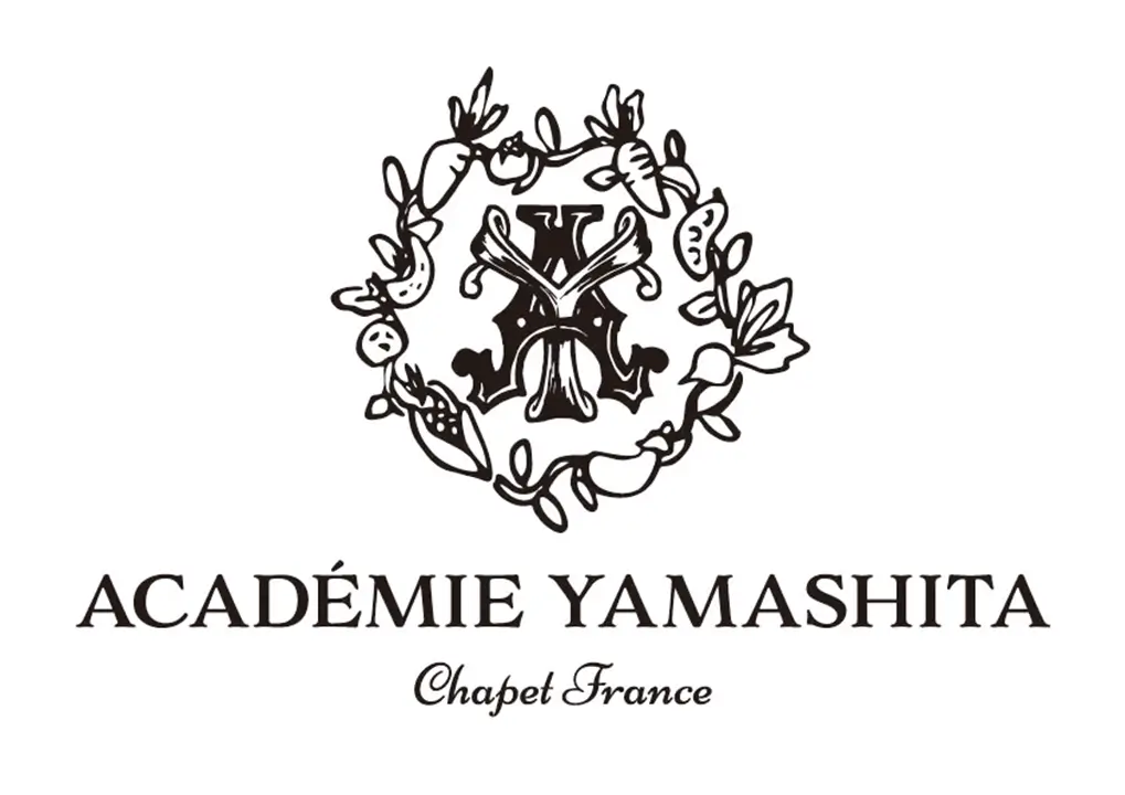
We were entrusted with the design of three key visual identities for Yamashita Farm, a renowned agricultural enterprise in France that cultivates Japanese vegetables and supplies them to Michelin three-star restaurants:(1) The logo design for Yamashita Farm ②The label design for their honey product, “HONEY TRAP” (2) The emblem logo design for “ACADEMIE YAMASHITA,” a newly established institution in France dedicated to teaching Japanese cuisine and agriculture.
Our collaboration began through an introduction during our time in France, leading to multiple design requests. As Mr. Yamashita has established a strong reputation in France’ s culinary scene and gained international media recognition, our design approach integrates his distinctive philosophy and creative vision. Using a relaxed yet sophisticated style, we incorporate calligraphy and sumi-e (ink wash painting) to reflect the uniqueness of his work.
– Design Lead –
- Car Seat Design
- Calligraphy Logo Design
- Portrait Sumi-e Artwork
case04Advertising for Supporting the Japan National Swimming Team
(JAPAN)
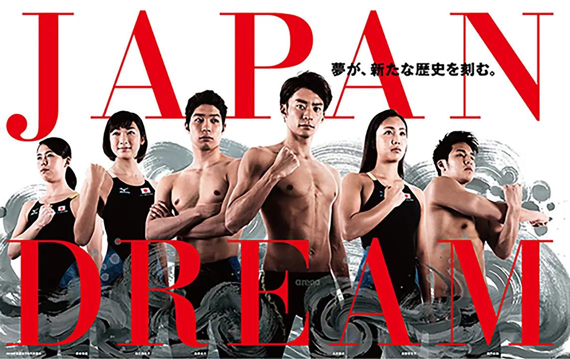
We were commissioned by a company serving as an official partner of the Japan national swimming team to create sumi-e (ink wash painting) artwork for the background of the 2016 official poster. The request was to depict water and waves in motion, embodying a distinctly Japanese aesthetic.
To achieve this, we created multiple individual elements using diluted ink and brush textures, capturing the fluidity and movement of waves. The final submission consisted of these separate components, which were later integrated into the poster design. The completed work was confirmed upon viewing the final printed poster, making this project more of a material contribution rather than a fully directed composition.
– Design Lead –
- Background “Wave” Sumi-e Artwork
case05Kimono Bottle Cover
(JAPAN)
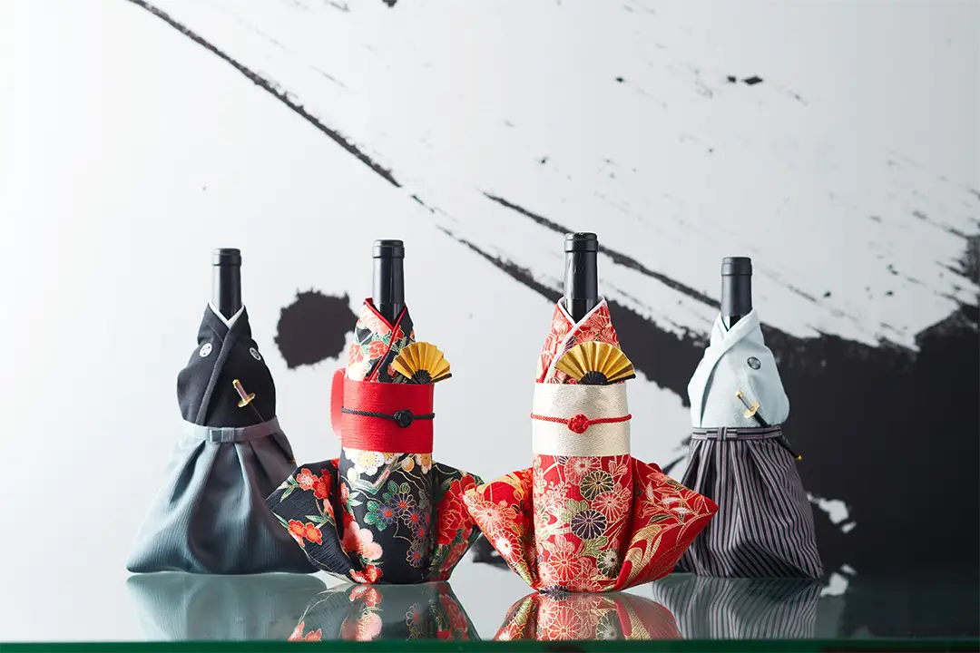
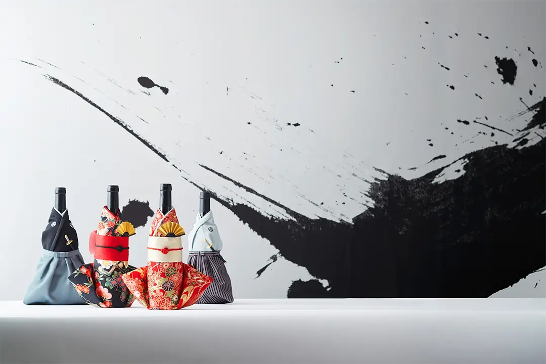
We provided artwork for a product that allows bottles of wine and sake̶winners of the Japan Tourism Agency’s COOL JAPAN Gold Award, Taiwan Award, and Germany Award̶to be decorated with kimono-inspired coverings.
The request was to create a dynamic sumi-e piece as a photographic backdrop, emphasizing expressive brush textures rather than traditional calligraphy. Instead of writing characters, we experimented with various brushstrokes and selected those with the most balanced energy and texture to achieve a visually striking composition. The final work leaned more towards an artistic sumi-e piece rather than a conventional calligraphy artwork.
– Design Lead –
- Background Sumi-e Artwork

